This work features one of my heroes, Bruce Lee, from his movie Enter the Dragon. I made it with pencil and colored pencil on paper.
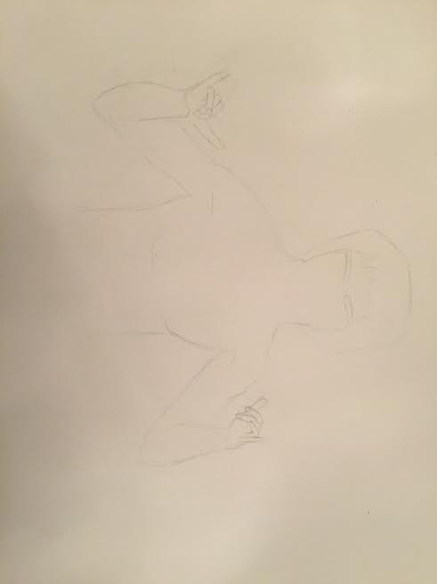
The first photo has the basic outline of the figure.
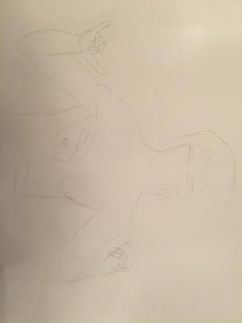
In the second photo, I added more detail on the body.
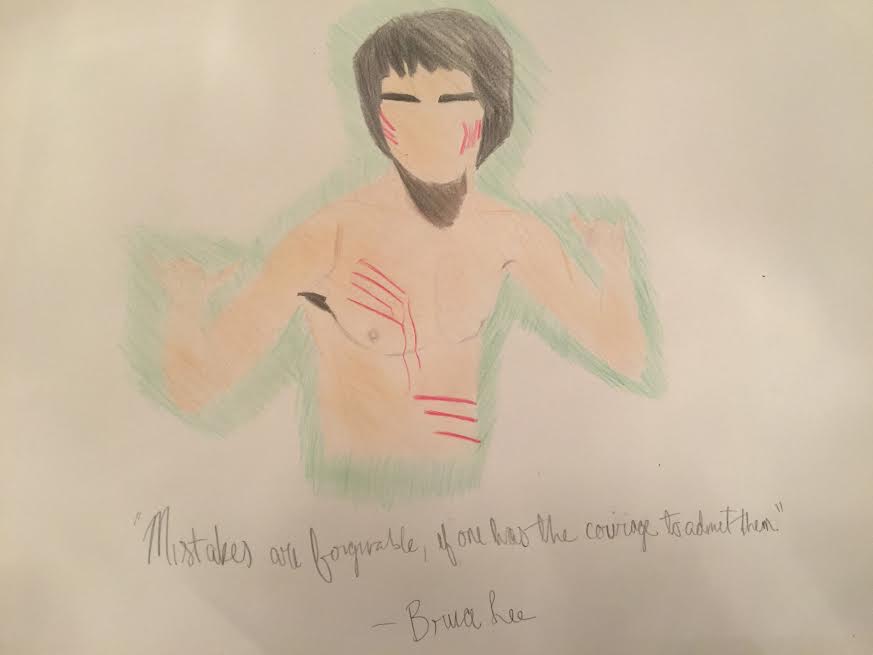
In this photo, I added color and wrote the quote "Mistakes are forgivable, if one one has the courage to admit them."
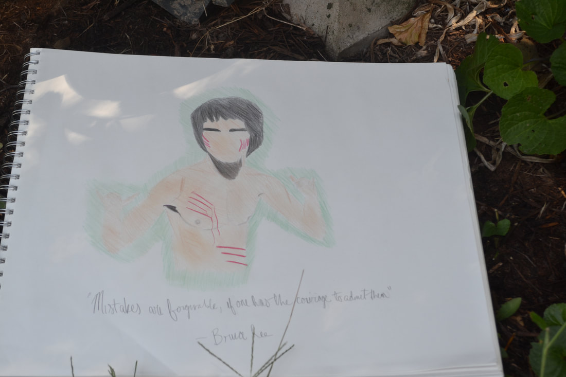
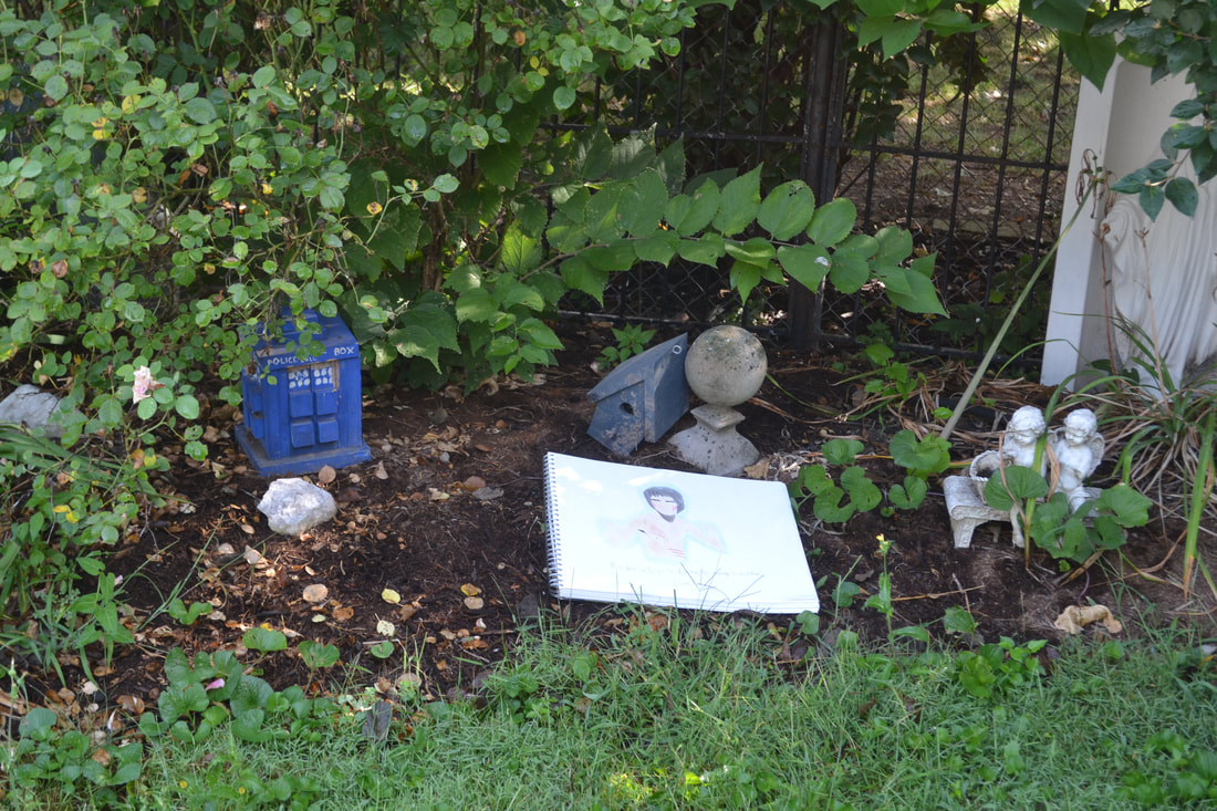
For these photos, I took my sketchbook outside and put it in the flower garden.
My work is titled “OH, YEAH!” because the drawing features the Kool-Aid Man and that is his catchphrase. My subject matter is the art hallway looking down towards the science hallway. I used Line because the drawing is in one-point perspective and Line is a big part of making one-point perspective seem real. A large number of the lines in the drawing was the brick Pattern on both of the walls. I drew the picture with pencils and made the Value with the varying greys of the pencils. My drawing started out as just the hallway and then I noticed the large garbage can on the wall. I thought, “Hmmm, that’s kinda big. Maybe someone should crawl out of that.” Originally, my friend EJ was going to climb his way out to freedom, but I realized it might be offensive so I drew myself in instead. My expression was of shock and amazement and I struggled to find something to put on the opposite wall to warrant my expression. A few days later, I had an epiphany of sorts. A thought popped into my head from somewhere. “What if the Kool-Aid Man were to bust through the wall?” The drawing evolved from there. (I realize that I forgot to take enough process shots. Sorry!)
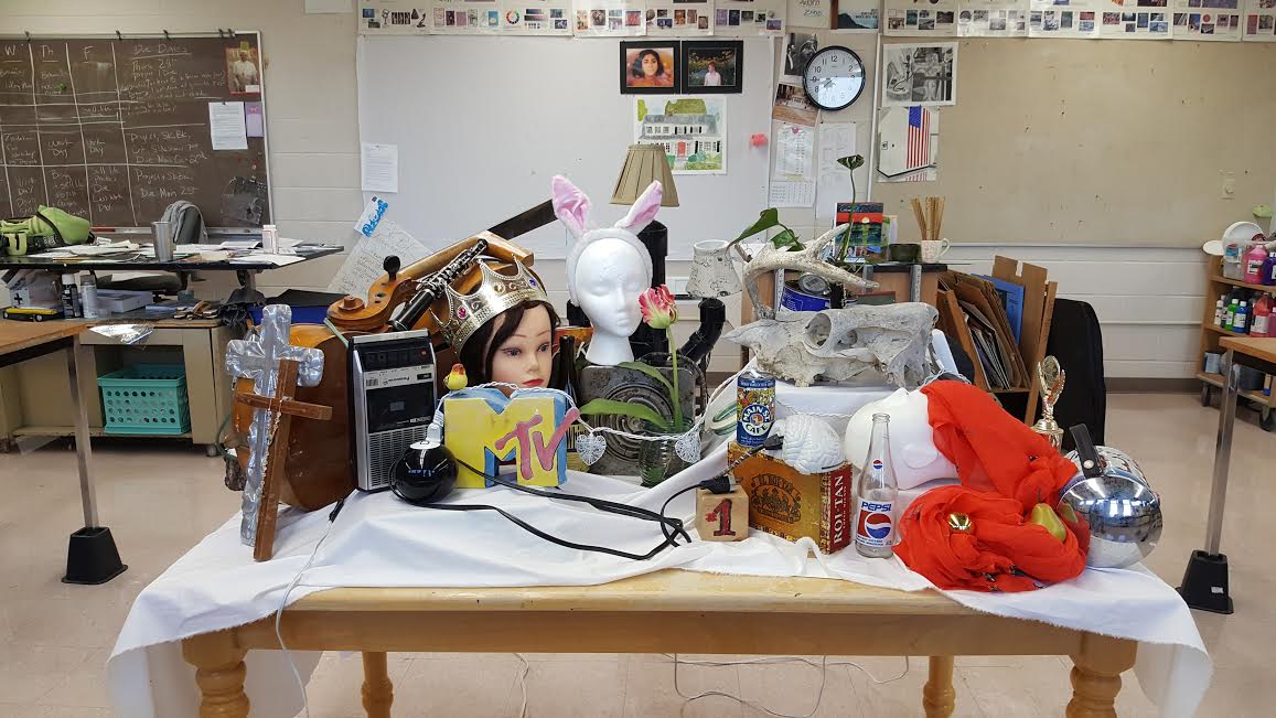
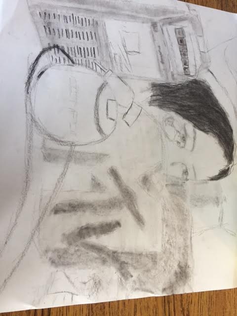
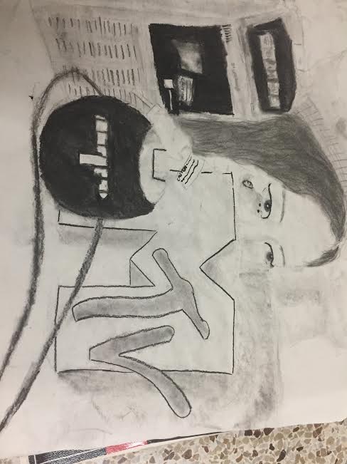
This work is titled Eclectic because it is a collection of random things. I used Line to denote the MTV logo with a hard line around the outside and implied line with the bits making it appear 3-D. Color plays a big part in this picture even though it is in black and white. Charcoal can create a wide variety of colors while still being just one. Proportion played a big part in this drawing through the viewfinders. "So if this is this big, then that should be that big." I used a dark outline on the MTV logo to emphasize it. The content of this work is a collection of random objects that Mrs. Off curated and arranged to create a very intriguing final product.
This piece is titled Reflecting on Reflections. It's based on a lyric from the song "Man or Muppet" from The Muppets. My subject matter is my bathroom mirror with me reflected in it. A big part of this project for me was Value, especially with using white charcoal on black paper. Using the white on black allowed for greater Contrast, such as the door frame with the space behind it. I think that I used Form fairly well on the towel ring through highlights and shadows. I also employed different Textures on the towel, the shirt, and the wall. My inspiration for the picture was just walking around my house looking for reflective things. I thought that the pose that I did was that of an edgy teenager, which is not completely true about me. At any rate, it's only a picture.
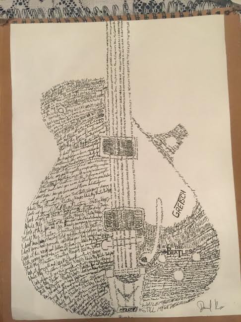
This wordle is of a Gretsch Duo Jet electric guitar made up of the lyrics to While My Guitar Gently Weeps by the Beatles. I picked to draw the Duo Jet because George Harrison, the writer of the song
This pen and ink project is titled Strider. This is because that is a nickname of sorts for the subject matter, Aragorn from The Lord of the Rings. He is one of my favorite characters from that book and I am currently taking the class on The Lord of the Rings. I used a fair bit of Contrast with the white of his face against the blacks and greys of his hair and the background. Line was important for me because I utilized hatching and a bit of cross-hatching on his face and stubble. I used Movement in the cloak with the ink going back over his shoulders to get a draped effect. I achieved different Values with various mark-making methods like stipple and hatches. Also, this project was the first time I had done a wash for real and I thought it turned out pretty well.
Quick note about the pictures: Preview was being weird and wouldn't let me rotate the photos. Anyway, this colored pencil is titled Reading Minds because I am reading from the notebook and things that are often on my mind are on the table as drawings. As would be expected, Color played a big part in this project for me, especially in my hair because it's not quite blonde and not quite brown. This project allowed me to go for more implied line through different Values which is nice because I usually draw with a harsh outline. I put Emphasis on me and even more on the book because they're right in front. I used Proportion with the people behind the table. So the drawings I have on the table are my notebook upon which I drew the Beatles, Archie and Jughead from Archie Comics, the four Houses at Hogwarts from Harry Potter, my friend Jordan as Sheridan Whiteside in last year's fall play just to show my love of theater, Terry's drill was there before I thought about the drawing thing, Eleven from the Netflix show Stranger Things, Woody and Buzz Lightyear from Toy Story, my favorite movie growing up, and the logo of Hamilton: An American Musical.
My painting is titled "Lofty Mountain Grandeur." The subject matter is a lake or river in Glacier National Park, or at least I think that's where this is. Anyways, two mountains meet at a body of water. Snow-capped mountains lie in the distance. Brush lies in the foreground of the picture. Color is something that is both easy and hard to portray in painting. It's easy because one does not have to rely on pressure to create different shades. However, mixes can prove to be a big challenge. The water was interesting to paint because a simple blue doesn't suffice. Space was also important to this project because of the mountains in the distance behind the branches in leaves in the direct foreground. It’s kind of interesting because Balance is achieved through the dark mountains almost reflected in the water with the light area in the middle of the painting and the dark on the sides in an upside down “v.” This creates a nice Contrast. I also used Contrast to show the snow on the tops of the dark mountains. This picture was taken by my mom on our summer vacation this past year. I think that it is a pretty cool shot, picture-wise. I like mountains and it was fun to paint
The title of my still-life is "Moderate Arts," as a play on the term "fine arts". The subjects of my still life are my choir folder and art box with a hint of my school fleece. Color played a big part in this project for me because there can be so much variety in colors that a painter chooses. Different mixes can create whole different moods for a piece. Because my picture was basically half dark blue and half oranges and browns, Contrast came into play. The way that the colors work with and against each other creates interesting effects. Shape was also important for me because there are a lot of rectangles and diagonals in the reference pictures. The diagonal lines create a kind of Pattern within the piece. The content of the painting is just stuff I had at school because I sort of forgot to bring in things. My choir folder has a piece of music sticking out. This song is one of my favorites that the choir is singing this year. My art supply box represents my love of art and artistic things
The title of my portrait is Don’t Bother Me. This is because that’s a song by the subject matter, George Harrison. The picture that I painted from was taken in 1964, at the height of Beatlemania. For me, value played a big part to create subtle facial structures. Painting color in black and white is very interesting because the mixes have to be just right. Using predominantly white or predominantly black in the mixes creates some good contrast when placed next to each other. The contrasting elements can really emphasize one another. I painted George Harrison because he's my favorite Beatle. The reference photo really speaks to me, you know.
The title of my work is "Take on Me to Africa." My subject matter is two people in a heart with an African background. Also, some mountains. I used aside variety of colors to depict the three songs. The variety of colors also helps to balance the work and the three varying songs. The brushstrokes in the sky add movement. The scenes contrast with each other. The deeper meaning is love, which might be obvious but I think that the world needs more love. The blue and white stripes represent the Scottish flag as a nod to the Proclaimers, a Scottish group that sang one of the songs I chose.
